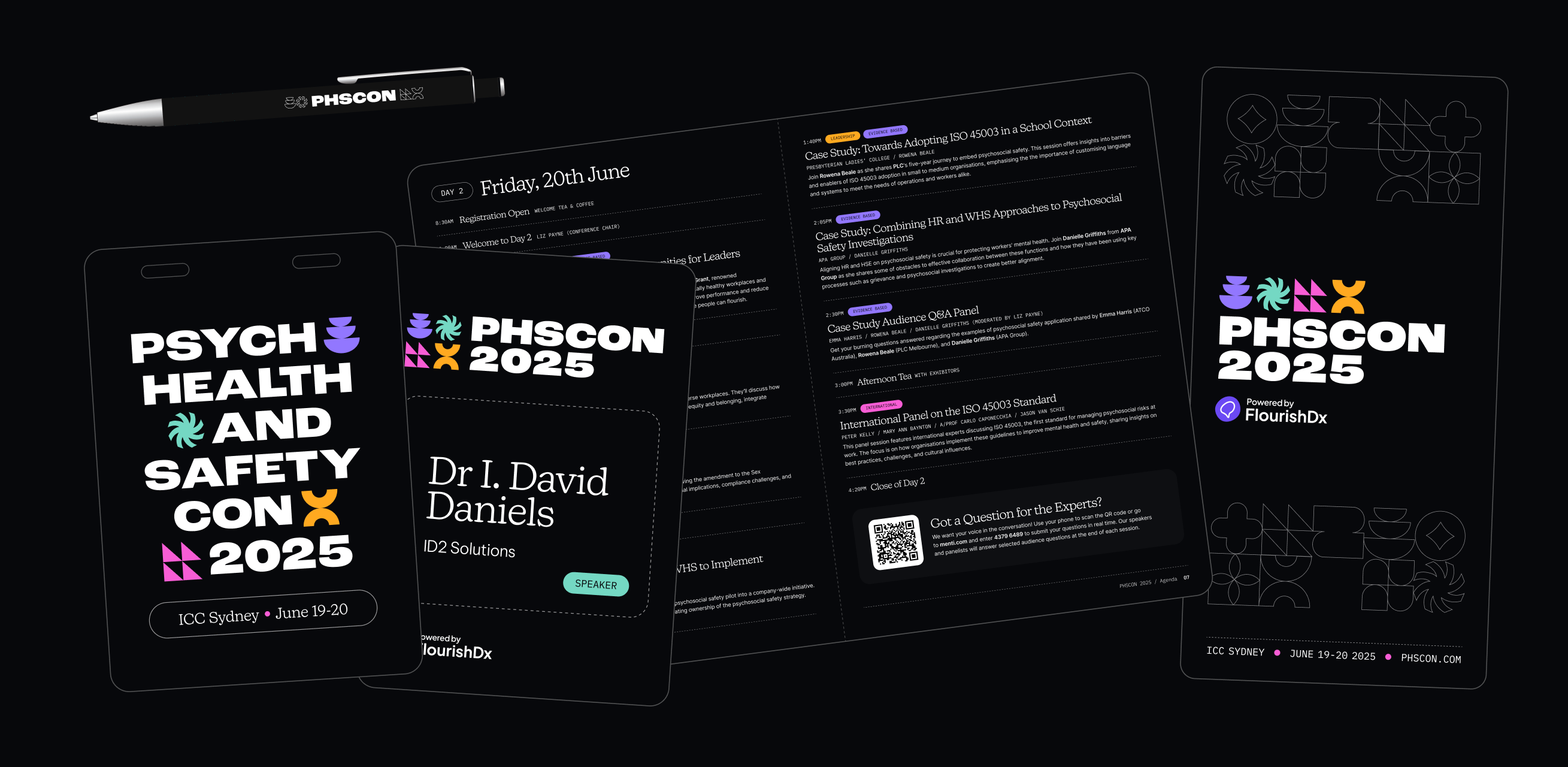
FlourishDx delivers psychosocial safety solutions to organisations across Australia and internationally. Each year, the company hosts the Psych Health & Safety Conference (PHSCON)—a flagship event bringing together global experts, practitioners, and industry leaders.As Senior Designer, I led the full brand design for PHSCON 2025, creating a distinct but connected identity that aligned with the FlourishDx master brand while giving the conference its own bold, energetic personality.

PHSCON’s original event identity served its purpose for the inaugural conference but lacked the depth and flexibility needed for a growing, content-rich event. The visual system was flat, single-toned, and didn’t connect meaningfully to the FlourishDx parent brand—making it difficult to convey professionalism while still feeling creatively distinct.
Because the system didn’t support thematic categorisation or modular layouts, it fell short when applied to the expanding set of conference materials. As PHSCON matured, it needed a scalable identity with clearer structure, stronger personality, and a more intentional relationship to the core FlourishDx brand.
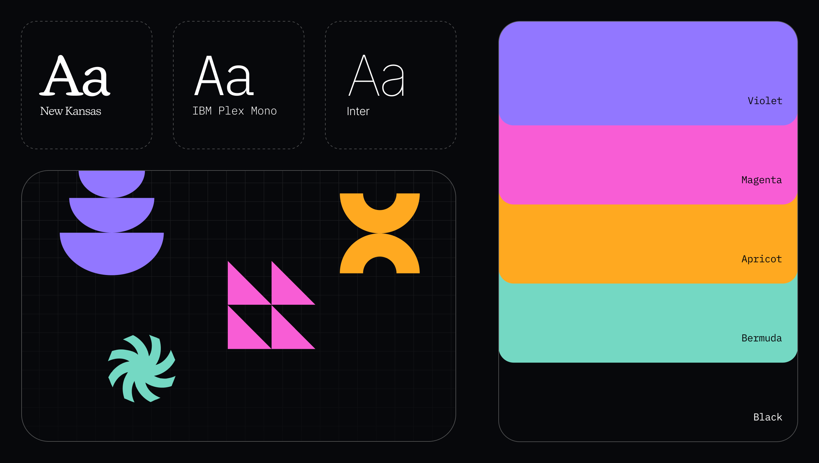
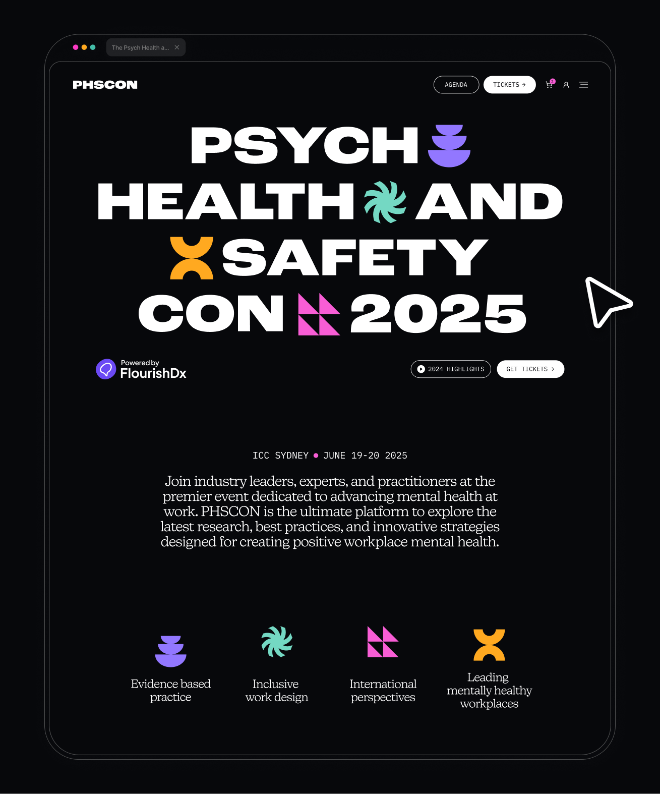
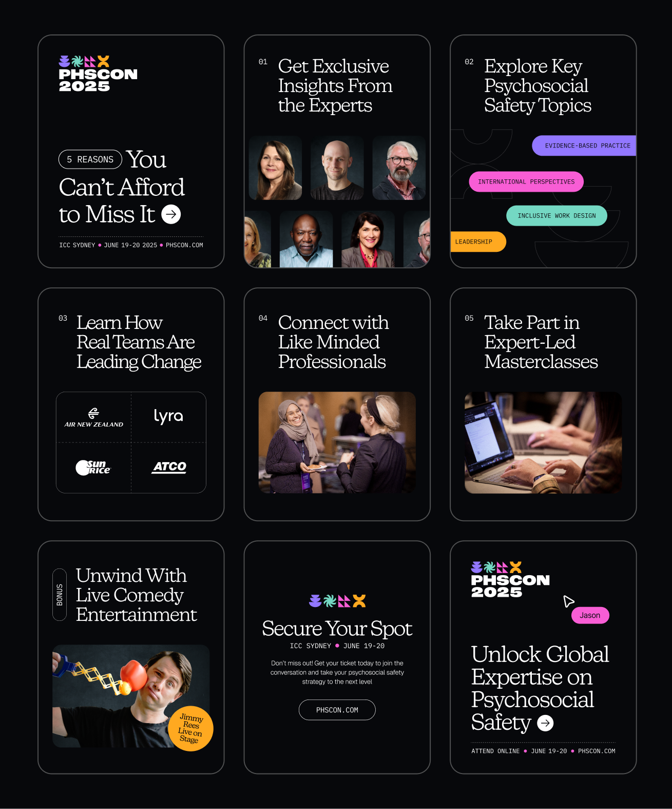
For PHSCON 2025, I created a refreshed identity that remains connected to the FlourishDx brand through shared secondary colours, typography, and grid elements, while using bold black backgrounds to give the event its own striking, energetic presence.
Geometric shape motifs represent key conference themes and slot into the grid system like moving parts of a whole. The four-colour palette enables clear content categorisation across agendas, signage, and digital collateral, while the grid ensures layout consistency.
The system is designed to be reused and evolved each year—distinct enough to be instantly recognised as PHSCON, yet flexible enough to grow with the event.
Hit me with your design thoughts.
Have questions or want to discuss your design needs? I'd love to hear from you! Simply fill out the form and I'll get back to you soon.
Rhiannon Davies, 2025